

Redesigning Discovery to Feel Calmer, Clearer, and Credible
Algorithmic aggregation surfaced a wide range of content, but offered little guidance. Items competed visually, navigation lacked orientation, and paths into events and subscriptions felt disconnected. People scrolled, but rarely stayed.
The Challenge: Clutter, Competition and Authority
Turn an algorithmically dense, visually competing feed into a clear, guided discovery experience that builds orientation, connects users to events and subscriptions, and drives deeper engagement and return.
Key Objectives:
- Make algorithmic surfacing readable—and trustworthy. Reduce noise, improve hierarchy, and help users understand what they’re seeing at a glance.
- Cut cognitive load across discovery. Simplify scanning, reduce visual competition, and make “what to do next” obvious.
- Add editorial structure that signals purpose and priority. Use curation cues, grouping, and labeling to turn volume into guided discovery.
- Create clear paths into action. Stronger entry points to events, follows/interests, and subscriptions—not buried, not bolted on.
- Build out events as a commercial engine. Make events feel premium and time-bound, connect them to subscriptions, and design repeatable flows that support conversion and return.
Strategic Shifts
Instead of tackling screens one by one, I focused on a series of foundational shifts, each aimed at making algorithmic discovery feel clear, intentional, and worth engaging with.
Each shift balances automation with human judgment, using editorial structure, naming, and interaction patterns to turn algorithmic discovery into a coherent, engaging experience.
1.
From Chaos to Clarity: Creating a Calm, Intentional System
I began with a design audit to understand where inconsistency and ambiguity were undermining clarity. Rather than fixing issues screen by screen, I translated those findings into a restrained design system, encoding decisions about layout, typography, color, and interaction behavior.
This created a calm, predictable foundation so algorithmic content could feel intentional, legible, and trustworthy.
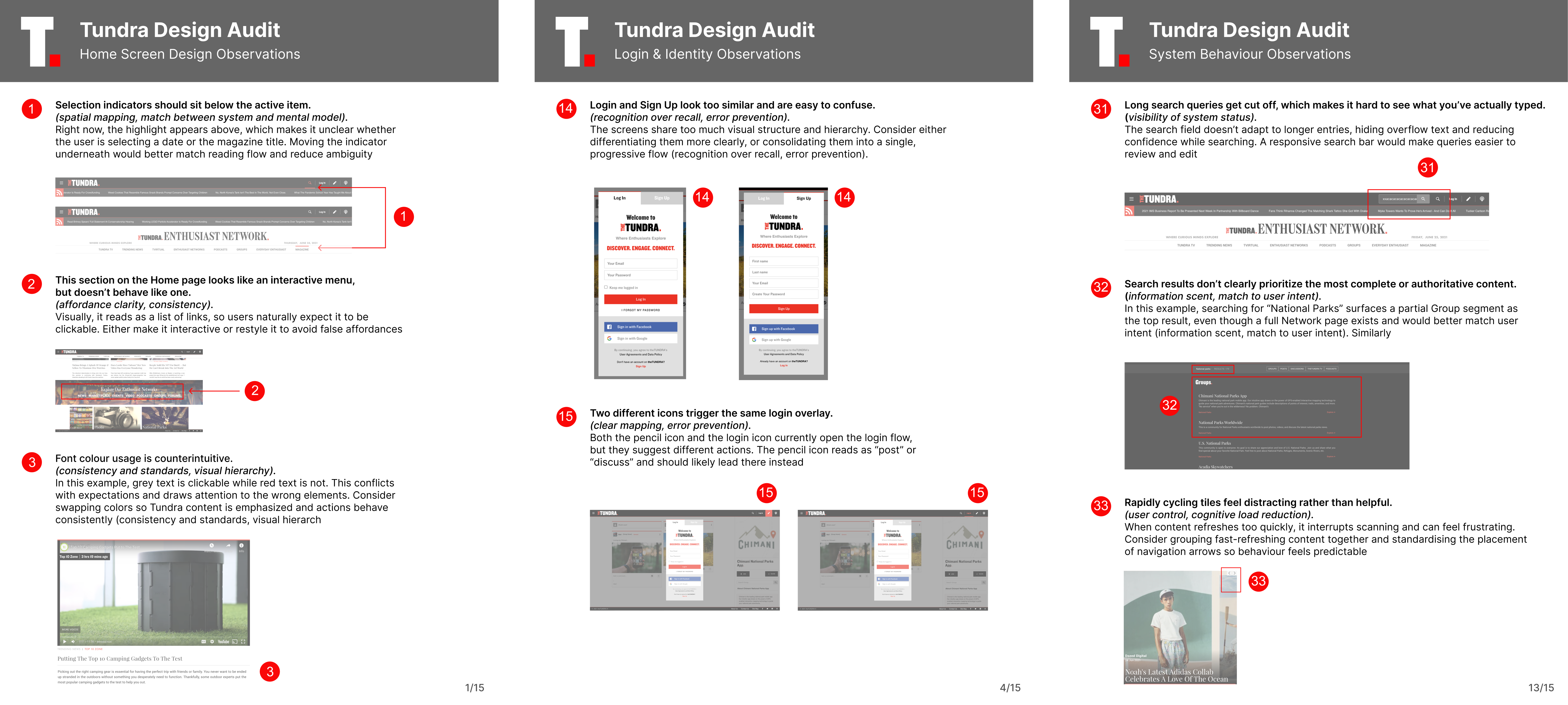
Examples From the Design Audit Exposing Inconsistency in Design and Expeirence
It led to a clear system for layout, type, color, and interactions so the experience felt intentional and easier to use.
Layout, Typography, and Color Were Standardized to Remove Ambiguity.
The result was a calmer foundation that made discovery feel effortless and intentional.
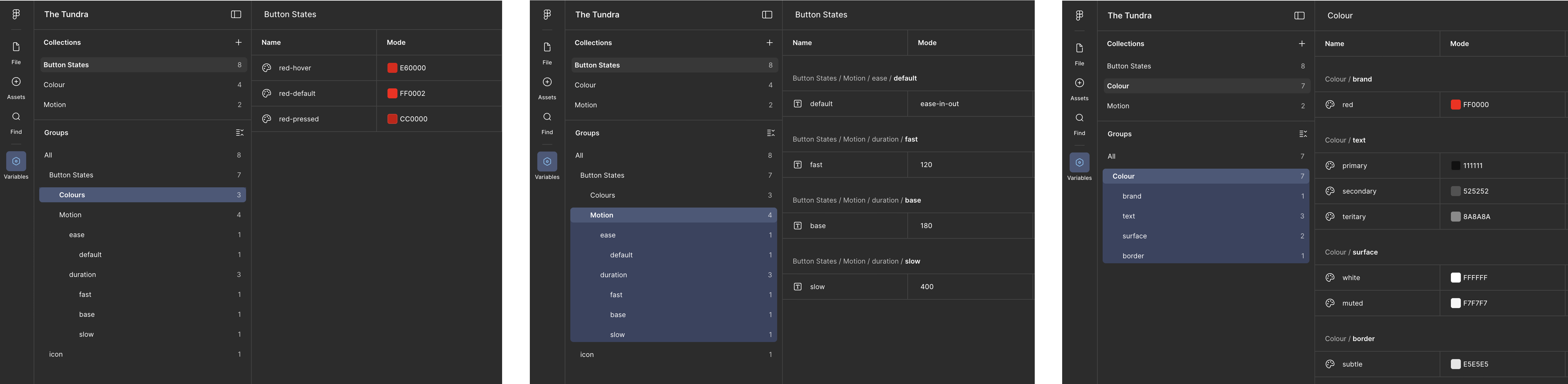
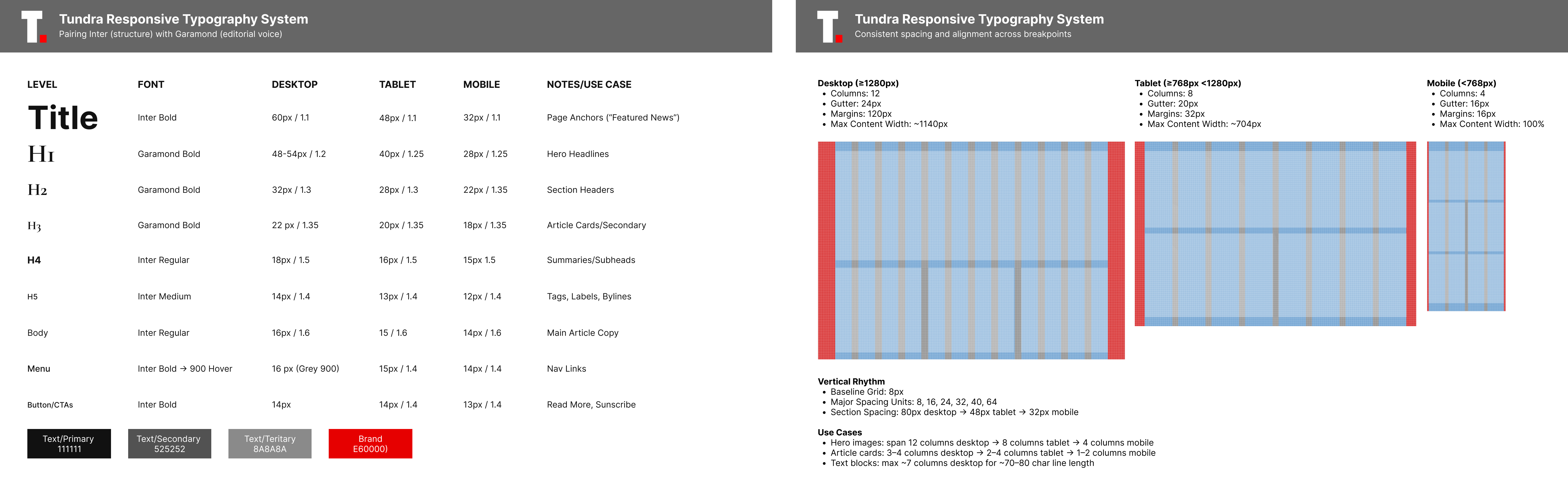
Design Tokens
Semantic color and motion tokens reduced visual noise and made interactions feel intentional and consistent.
Key Improvements:
- Systemized layout and typography to restore hierarchy and clarity.
- Clarified intent by reserving brand color for moments that require a decision.
- Standardized interaction and motion to make navigation predictable and bring efficiency to product development.
2.
Designing Discovery
Algorithmic aggregation gave The Tundra reach, but not orientation. Content surfaced at scale, but the presentation was flat and noisy. It was hard to know what mattered, what to skim, and where to go deeper.
Building on the design system foundation, this shift focused on making algorithmic discovery readable—so users could quickly assess value and trust what they were seeing.
On the home screen content was grouped into clear roles like Featured, In Focus, and Events, so users could quickly see what each piece was for and how deeply to engage.

A Calmer More Premium Home Screen
Clarified hierarchy and pacing so users can quickly see what to browse, what to pause on, and what’s worth deeper attention.
One Home Screen System Now Scales Gracefully Across Devices
Desktop, tablet, and mobile stay consistent without losing clarity.
Before - Home Screen
Audit findings showed that the pre-existing home screen suffered from flat hierarchy, competing content, and unclear signals. Content and categories appeared equally important, making discovery noisy and hard to trust.
Key Improvments
- Clarified hierarchy and pacing so users can quickly see what to browse, what to pause on, or explore morre deeply
- Improved orientation at scale without adding noise. Preserving a calm, premium feel.
- Enabled faster, clearer pathways from discovery into events, follows, and deeper content.
- Created a scalable Home Screen system that feels premium across desktop, tablet, and mobile.
3.
From Discovery to Engagement: Desiging Events as a Core Experience
Once discovery was readable, the next challenge was depth. Events did not yet exist as a product surface, despite being a growing business opportunity.
This shift focused on designing events from the ground up, and embedding them into discovery, editorial, and interest networkss. Curriosity could then turn into participation, fueling long-term engagement and subscriber growth.
Events are surfaced directly within the main feed, making participation visible without requiring users to navigate elsewhere.
Placing events alongside articles and video establishes events as part of the core experience, not a secondary feature.
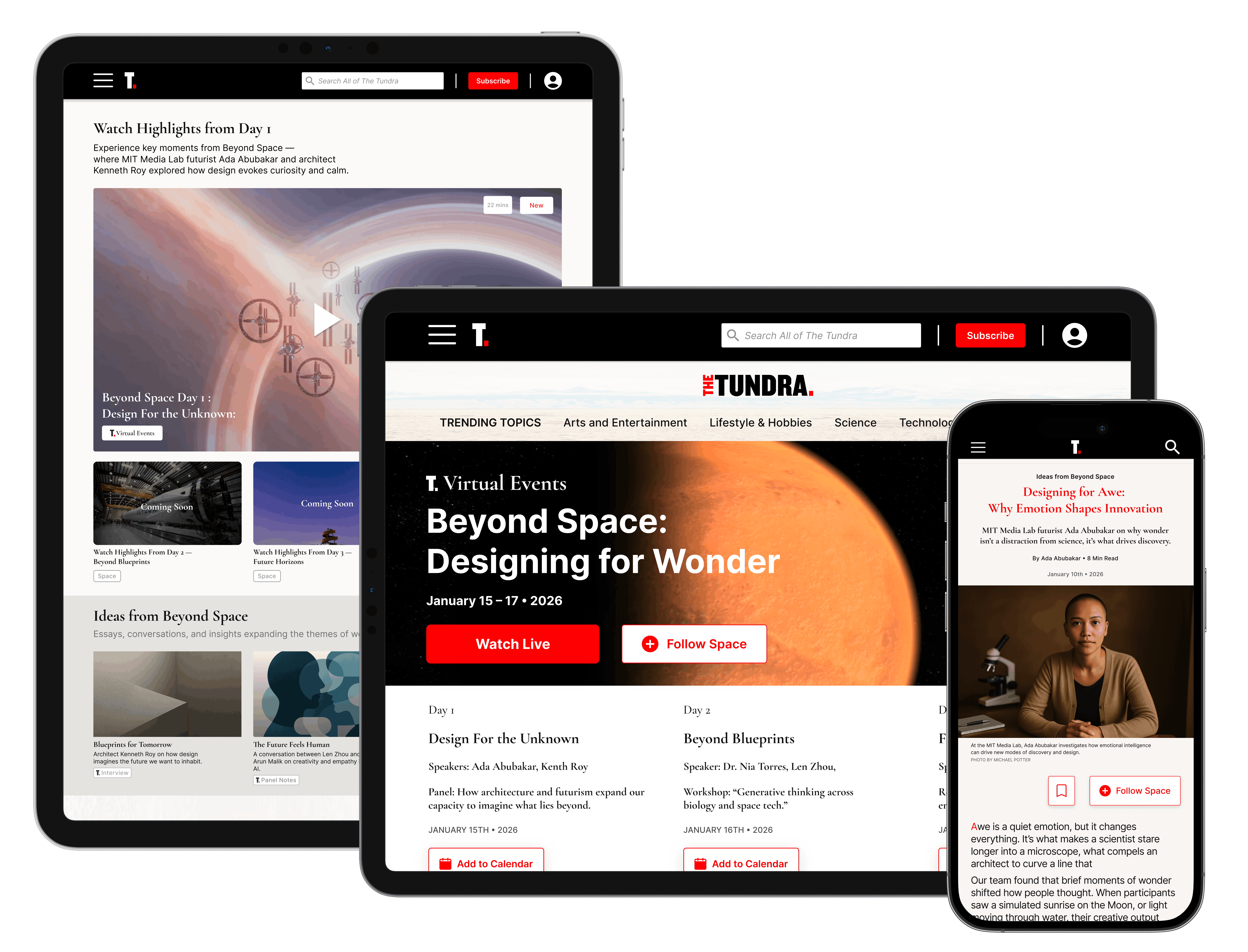
The Tundra Events Page: Annotated Overview
Events were designed as a cohesive editorial experience, not standalone content. Structured tags, scheduling, and exclusivity cues guided participation, encouraged return visits, and reinforced brand value.
Tablet View Balances Clarity and Flexibility
The layout preserves editorial structure while adapting to touch interactions and varied screen orientations—supporting both lean-back browsing and active engagement with content and events.
Mobile Preserves Momentum Without Losing The Story
Content flows in a linear scroll that supports glancing, pausing, and going deeper, with key actions optimized for thumb-friendly access.
Key Improvements
- Integrated events into the core discovery flow rather than treating them as standalone promotions.
- Used articles and editorial framing to build interest and context ahead of events.
- Designed event pages as destination experiences, supporting both one-off and recurring programming.
- Clearer paths from discovery → interest → participation
The Tundra — Impact & Outcomes
A shift from algorithmic density to guided discovery.
We redesigned Tundra as a premium editorial experience—clearer pathways, calmer hierarchy, and stronger signals of what matters now.
Measurable Outcomes
- Average session length: from under 60 seconds to ~7 minutes.
- 48% increase in subscriptions within 9 months.
- Interests saved per user: from ~2–3 to ~5–7, signaling stronger intent, clearer identity, and better long-term personalization inputs.
What Enabled Those Results
- A cohesive system across devices. Desktop, tablet, and mobile behaved like one product—consistent patterns, predictable navigation, and a stable reading rhythm.
- Intent-based IA, not brand-centric navigation. We replaced internal labels with clear interest-led paths that matched how people expect to explore a modern media platform.
- Hierarchy that reduces choice fatigue. The feed stopped competing with itself. Featured items earned attention through structure, spacing, and prioritization.
Limitations & Learnings
- Discovery isn’t a strategy unless it’s guided. Algorithms can surface variety; people stay when the product provides direction and meaning.
- Density is an editorial problem as much as a UI problem. The breakthrough wasn’t “less content”. it was making judgment visible: what’s featured, why it matters, and what to do next.
- Personalisation is a tradeoff, not a feature. Tune it too hard and you lose serendipity; leave it loose and you reintroduce noise.
- Conversion can’t feel bolted on. Subscriptions worked best when they felt like a natural continuation of discovery, earned through context, not inserted as an interruption.

