
Designing for Confidence: Modernizing a Donor Platform to Unlock Generosity at Scale
Core donor actions were buried in dense dashboards and form-heavy workflows, while related experiences evolved independently, creating inconsistent patterns, unclear entry points, and a lack of shared structure across the platform.
Solving this required more than simplifying screens. It meant clarifying core donor behaviors and establishing a shared model for how actions should work, creating a foundation for a more consistent, scalable product ecosystem.
The Challenge: Scale, Simplicity and Trust
Bring clarity and consistency to a fragmented, high-stakes donor ecosystem, creating a trustworthy experience that simplifies financial decisions and supports consistency at scale.
Key Objectives:.
- Re-architect donor flows around high-value financial behaviors
- Translate complex financial data into clear, actionable insights that support confident decision-making
- Redesign dense, compliance-driven workflows for clarity, completion, and trust
- Reinforce donor trust through clear intent-driven actions, contextual guidance, and transparent feedback
- Bridge design and engineering through a modular system of reusable design objects enabling consistent, scalable product development
Research & Insights: Understanding Donor Behaviour
To modernize the donor experience, we first needed to understand how people actually navigated the portal.
Through card sorting, tree testing, and usability walkthroughs, we identified three core issues: key actions were difficult to locate, the experience lacked clear hierarchy and structure, and dense, compliance-driven forms created friction at critical moments.
These insights led to a behavior and pattern-driven approach, creating a more consistent product experience.
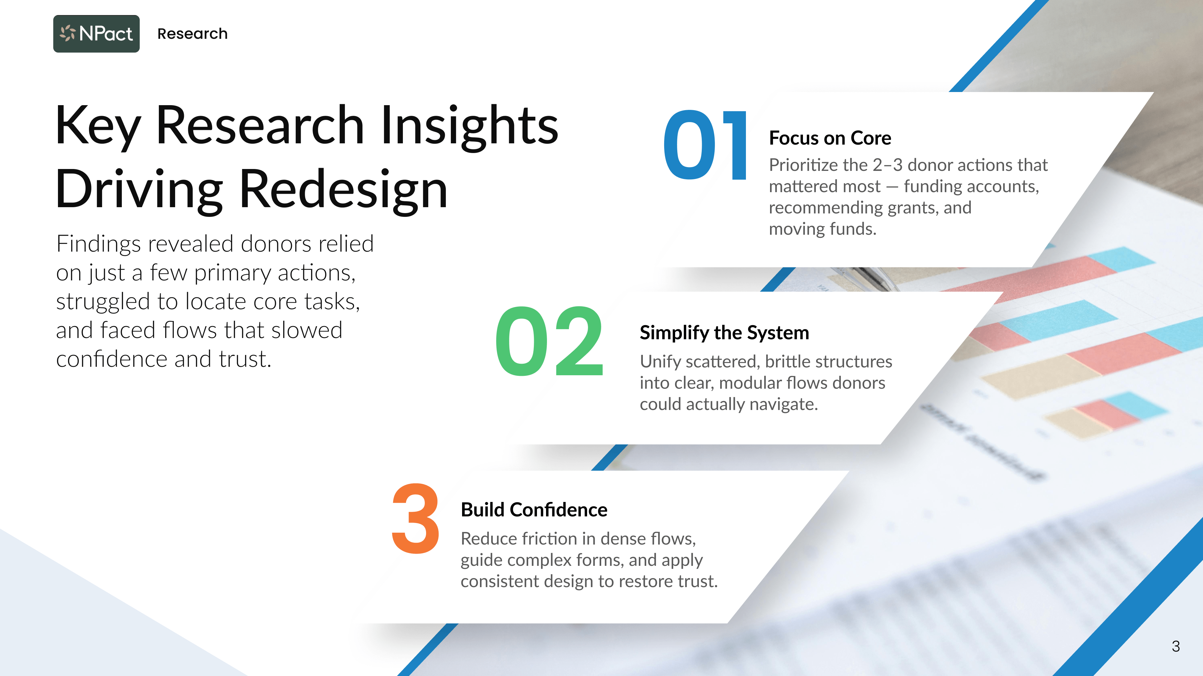
Research showed that clarity, structure, and feedback drive confidence
Donor confidence depended on clear entry points, predictable structure, and transparent feedback.
1.
Design Around Donor Behaviour
I restructured a flat, system-driven dashboard into a donor-centric hub that prioritizes key financial actions, clarifies hierarchy, and makes intent immediately clear.
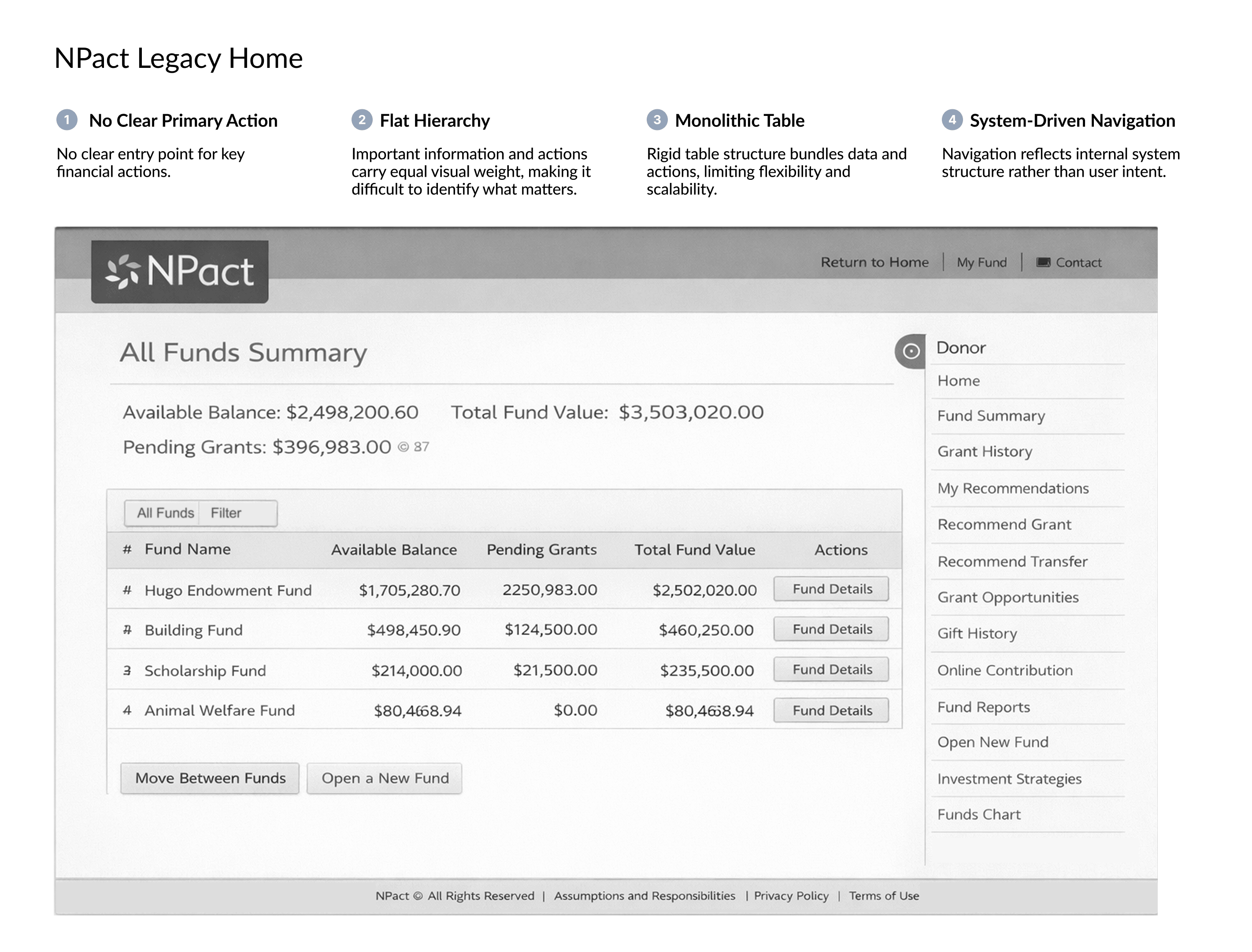
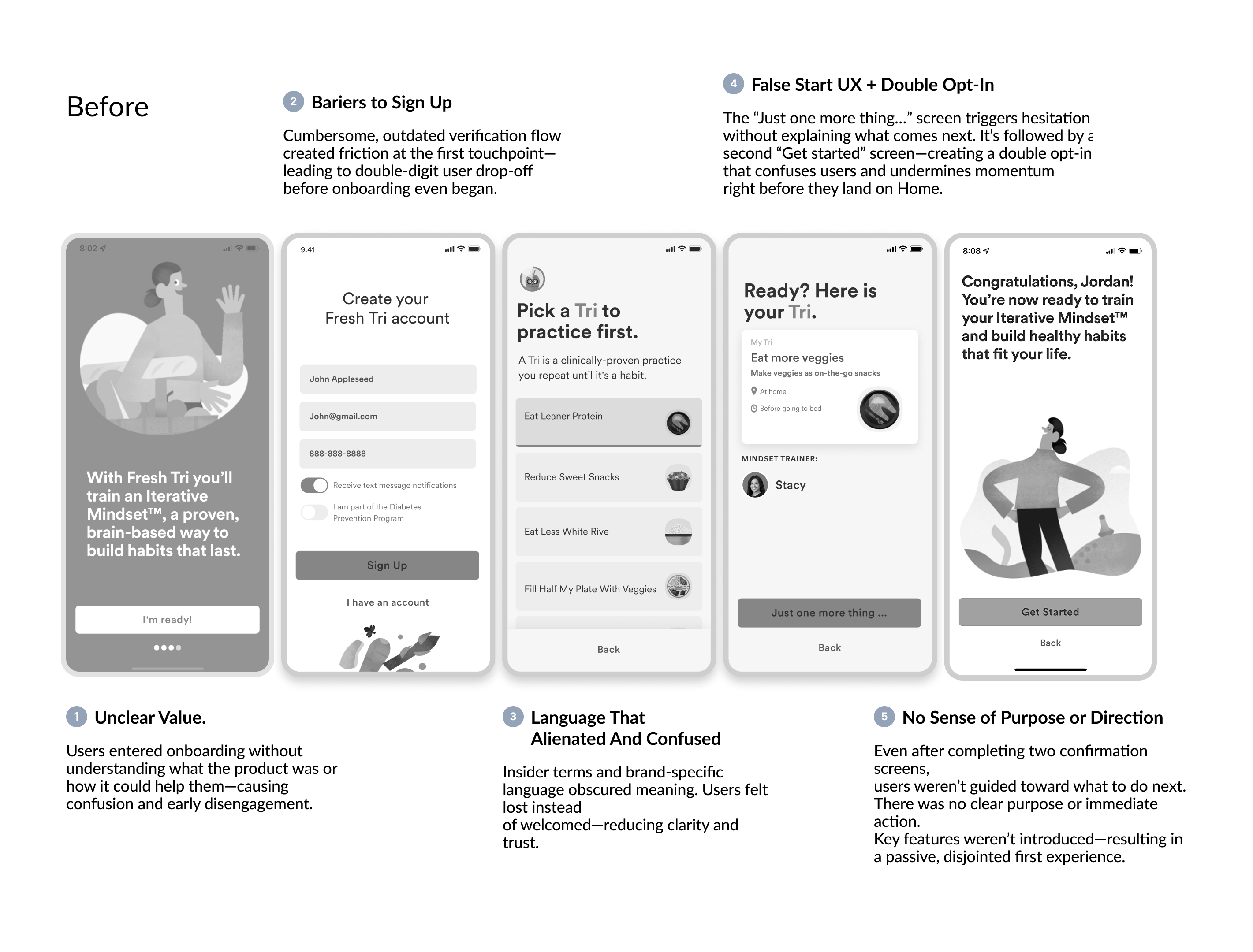
Legacy donor hub before the redesign.
A page-by-page system with limited hierarchy, structure, and guidance
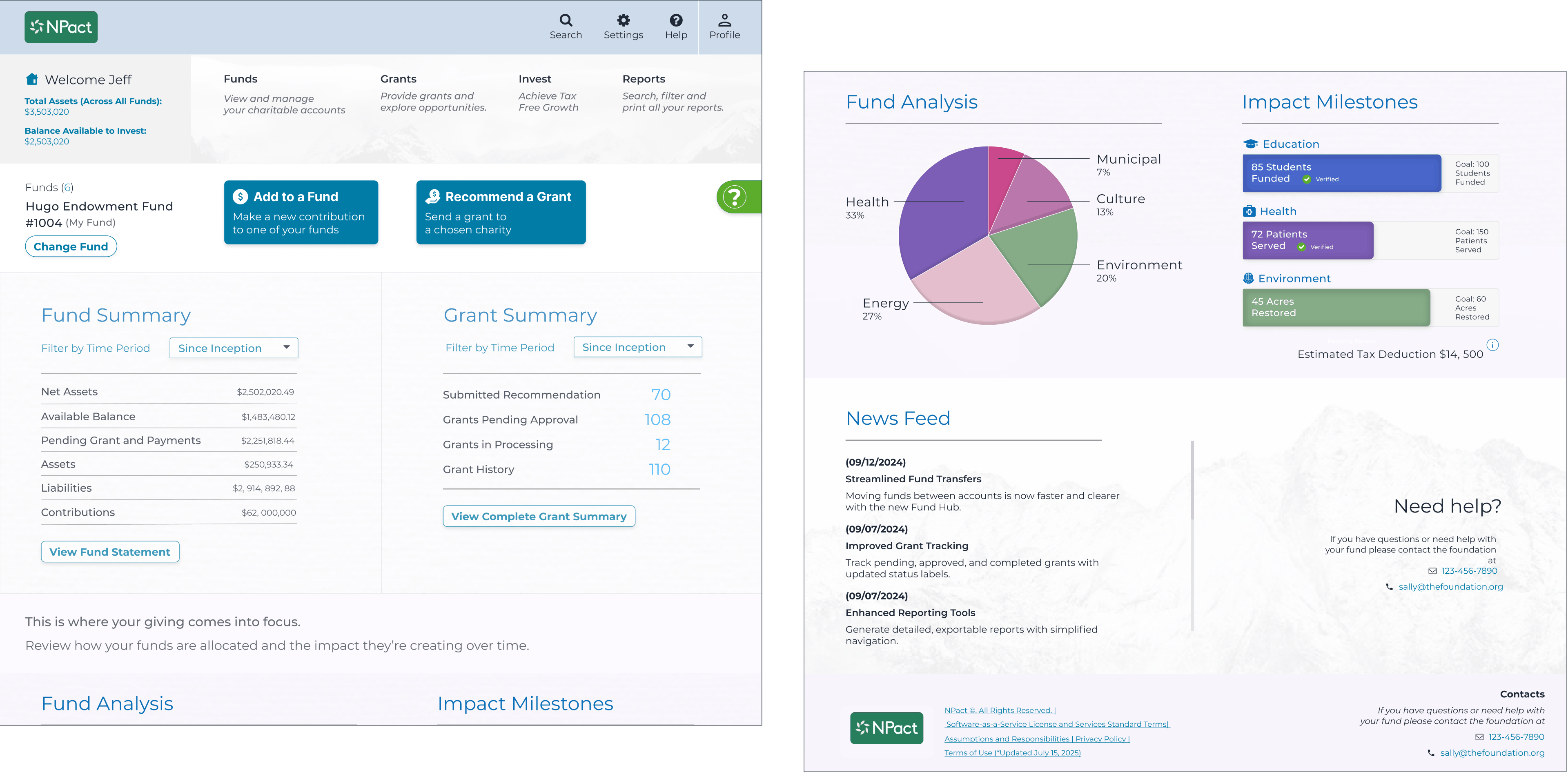
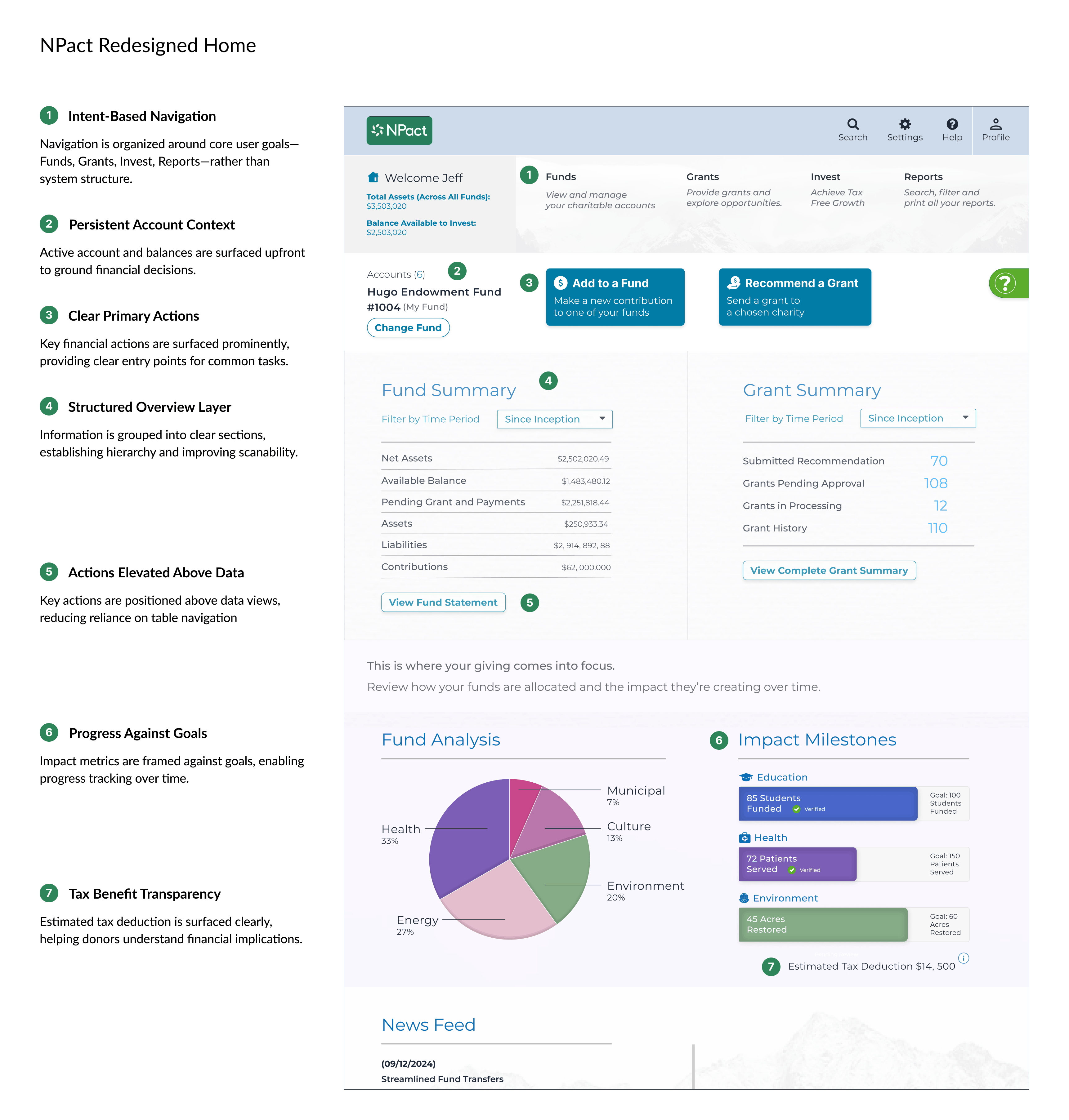
The donor hub was rebuilt around how donors actually give.
Key actions are clearer, faster to reach, and easier to complete with confidence.
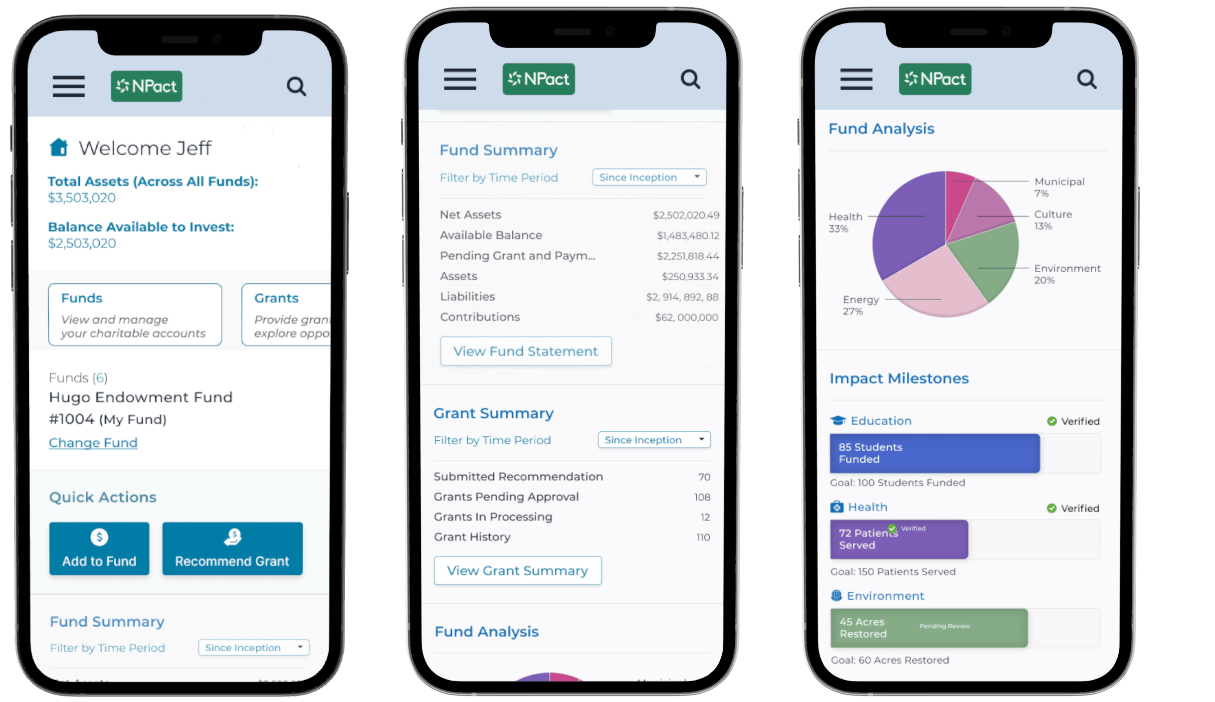
Mobile donor home was designed around intent.
Quick actions come first, with insights and detail revealed as users scroll.
Key Improvements:
- Action-first orientation - Replaced system-driven navigation with clear, behaviour-based actions like Add to Fund and Recommend a Grant.
- Clear hierarchy over dense dashboards - Suraced balances and primary actions first, reducing noise and helping donors act without scanning or decoding the UI.
- Guided decision-making - Added contextual cues and helper text to clarify next steps and build confidence at moments of action.
- Designed for momentum, not maintenance - Reframed the home from a passive summary into an active starting point for giving.
2.
Design A Modular, Scalable System
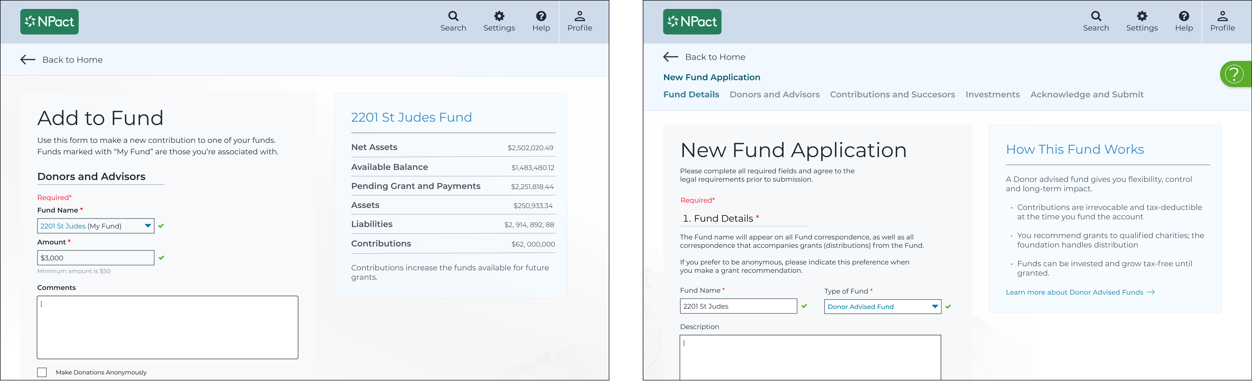
We replaced one-off panels with a modular system of reusable fund components, creating a consistent foundation for how data, actions, and states are structured across the produc.
Each fund was treated as a coherent object—bringing together balances, activity, and actions in a predictable format—making it easier for users to understand and for teams to extend.
This modularity set the stage for Shift 5’s deeper design-engineering partnership, enabling clarity, reuse, and velocity across teams.
Read more: Object-Oriented Design in Digital Product Work

A modular system carried through action.
The same fund card framework moves seamlessly from the hub into the transfer flow, preserving context for donors and enabling reuse at scale
.png)
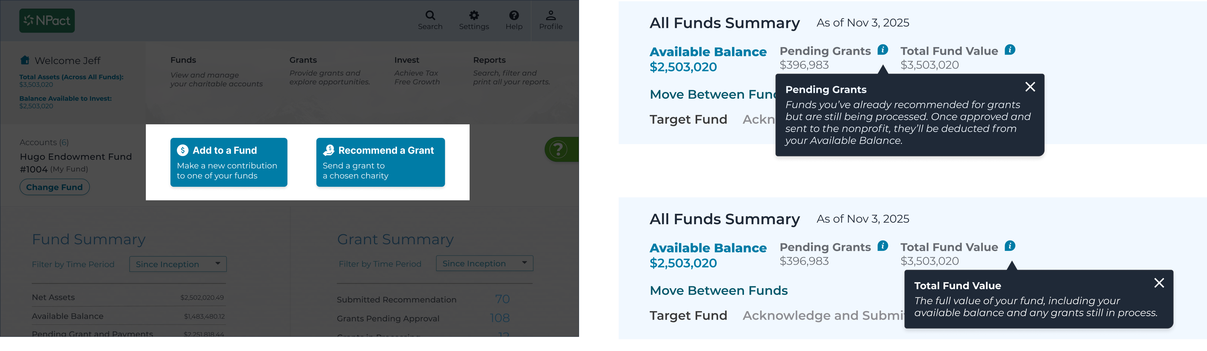
Fund cards explain the state of the money before inviting action.
This turns financial complexity into clearer, more confident decisions.
Key Improvements:
- Card-based fund hub gave donors a clear, scannable overview of balances, grants, and actions
- Reusable patterns replaced ad-hoc layouts, creating consistency across flows
- Status labels and tooltips clarified pending vs. available balances, reducing uncertainty
- Toast confirmations provided lightweight feedback without interrupting the flow
3.
Reinforce Trust Through Guidance and Feedback
Clear language, timely guidance, and feedback removed doubt at critical moments.
Events are surfaced directly within the main feed, making participation visible without requiring users to navigate elsewhere.
Placing events alongside articles and video establishes events as part of the core experience, not a secondary feature.
Context Cards Add Reassurance at the Moment It’s Needed
They clarify intent, constraints, and outcomes right before high-stakes actions.
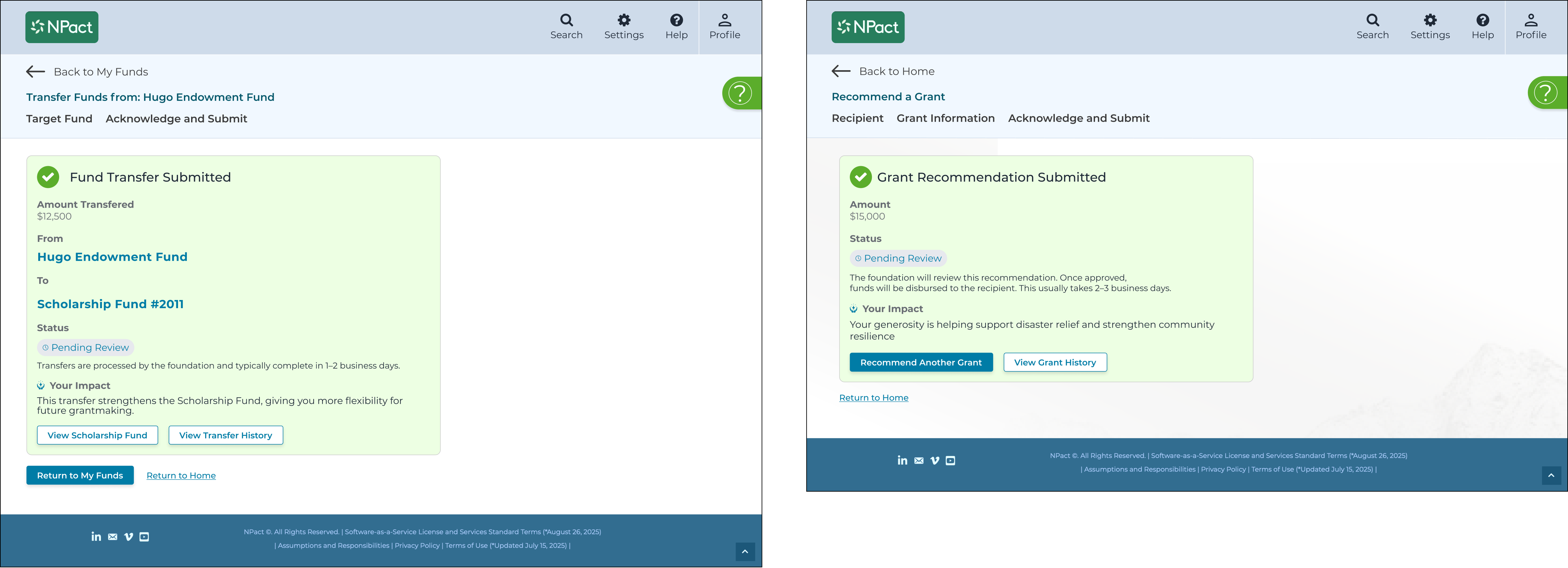
Confirmation States Validate Success and Guide the Next Step
They reduce drop-off after high-value actions and keep momentum moving.
Helper Copy Resolves Common Financial Confusion In the Moment
It clarifies pending grants, fund value, and the difference between adding funds and recommending grants, reducing cognitive load at decision time.
Key Improvements:
- Contextual guidance surfaced inlines (cards, helper text, tooltips) to reassure and inform users without breaking flow,
- Transparent status indicators removed clarified what was pending, completed, or in progress
- Confirmation states closed the loop increasedn with reassurance. next steps and momemtum-fotward CTAs
- Reduced dead ends rei by turning completion momemnts into clear transitions rather than stopping points.
4.
Streamlining High Value Donor Flows
From Overwhelming Forms To Guided Task Flows.
Before: Intimidation, Friction, and Drop-Off
Compliance-heavy forms were intimidating, with no hierarchy or support — creating hesitation and drop-off.
After: Guided Flows That Build Confidence and Momentum
We preserved every legal requirement while redesigning the experience around progressive disclosure, clear hierarchy, and supportive language. Forms became guided task flows that reduced friction, built confidence step by step, and helped donors complete high-value actions with clarity.
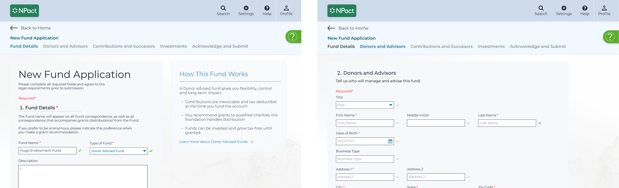
A Guided New Fund Application Replaces a Long, Intimidating Form
Clear steps, embedded context, and progressive disclosure make it easier to complete accurately while maintaining every compliance requirement.
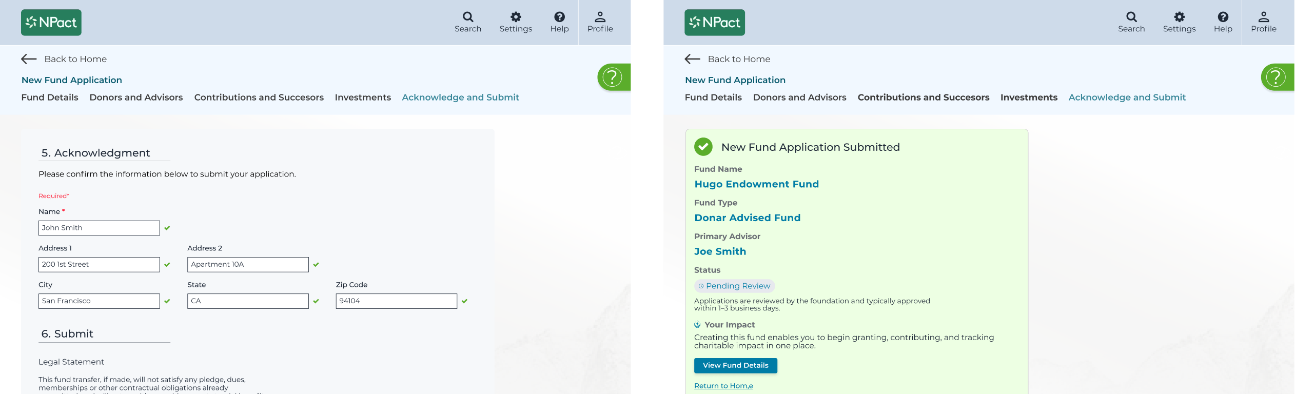
Mobile confirmation guides users from acknowledgment to signature to submission.
The flow keeps effort focused and makes completion feel straightforward.
Key Improvements:
- Chunked forms reorganized long inputs into step-by-step flows donors could follow with ease
- Human tone and hierarchy improved confidence and comprehension
- Inline status indicators clarified what was required and what was optional, preventing stalls
- Confirmation screens wrapped up each flow with impact framing + next actions, avoiding dead ends
5.
From Design Handoff → To Ongoing Partnership
Engineering once treated design as a set of reactive, one-off fixes. We shifted to a coaching partnership, embedding UX into planning and delivery. This elevated design from “screens to ship” into a sustainable framework for clarity, velocity, and measurable donor outcomes.
To support this shift, I applied Object-Oriented Design principles — traditionally rooted in engineering — to the design layer itself. Instead of flows and screens, we defined a modular system of design objects: Donor Tiles, Fund Cards, Insight Modules, etc., each with consistent properties, behaviors, and relationships.
This reframed design as a shared system, not just a deliverable. It aligned our thinking with how engineers already structure logic and components — using the same mental models of objects, classes, and instances.
Inspired by the engineering-centric approach outlined in Object-Oriented UX by Sophia Prater this model gave the team:
- Clarity around how UI mapped to data structures and business logic
- Velocity from reusable components and fewer design bottlenecks
- Consistency across donor experiences, even as functionality scaled
The outcome: a sustainable product foundation where design didn’t just ship screens, it shaped systems, unlocked engineering flow, and made every feature easier to maintain, extend, and evolve.
Key Improvements:
- UX strategy alignment connected modular design decisions to donor outcomes and roadmap priorities
- Shared object model replaced siloed handoffs with a common design-engineering language, grounded in Object-Oriented Design
- Sustainable delivery replaced one-off fixes with a scalable, reusable system—enabling faster iteration and long-term maintainability

