

Designing for Behaviour Change at Scale
Fresh Tri’s mission was to help people build healthy habits through mindset, practice, and community. But the product experience didn’t deliver on that mission. Fragmented flows, unclear value, and early friction left users disengaged before they could build momentum.
The Challenge: Momentum, Friction and Purpose
Turn a complex, fragmented experience into a clear, actionable daily practice, supporting habit formation and driving rapid gains in retention and engagement.
Key Objectives:
- Re-architect onboarding and habit flows to reduce friction and spark early practice
- Build a cohesive design system to unify fragmented experiences
- Establish a science-backed daily behaviour loop that reduces cognitive load and keeps users consistently in practice.
- Transform a shallow, academic content library into practical, actionable guidance using an AI-enabled RAG system, supporting both everyday practice and sustained long term engagement.
- Leverage PMF and retention insights to design repeatable social rituals that reinforce belonging and ongoing effort.
- Build AI-assisted internal tooling, including moderation, content quality systems, and an AI Habit Set Builder, to enable scale, safety, and future commercial pathway
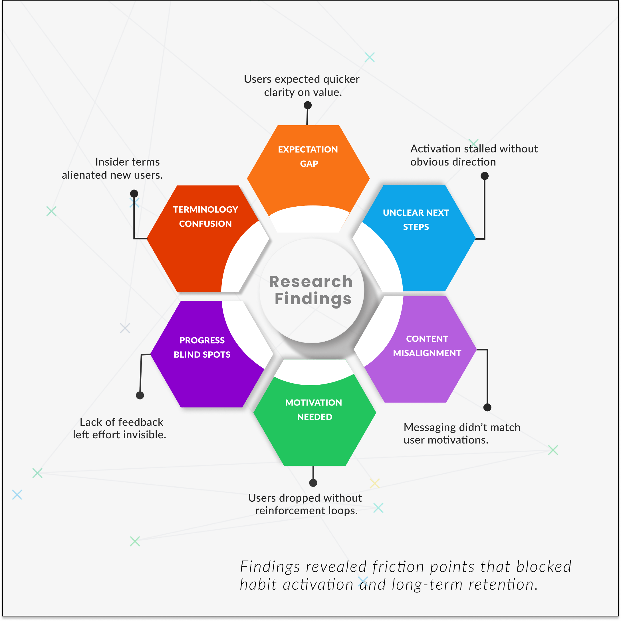
Research & Insights: Understanding Early Churn
Through surveys, churn analysis, PMF signals, and interviews, I uncovered six friction points blocking activation and habit formation. These insights directly informed the five strategic shifts that reshaped Fresh Tri’s core experience.
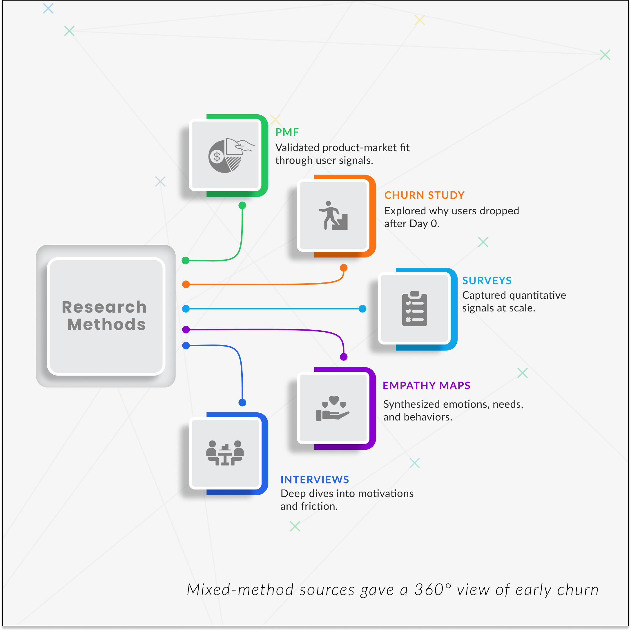
Across churn studies, PMF interviews, and behavioral research, the direction became clear: early clarity and momentum, a repeatable daily practice, practical guidance layered over time, and social signals that made effort feel shared rather than solitary.
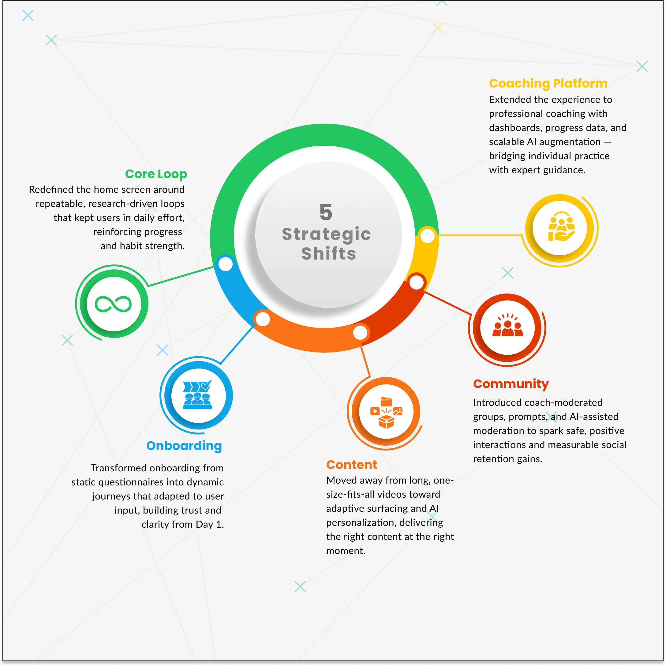
The redesign was guided by behavioral science frameworks, including COM-B and the CREATE Action Funnel, to ensure each surface increased capability, reduced friction, and sustained motivation across the daily habit loop.
1.
Onboarding Rebuilt to Boost Activation and Daily Engagement
The original flow lost users early. We redesigned it to reduce friction, clarify purpose, and spark daily habit practice. The results were stronger activation, more conversions and longer long term retention.
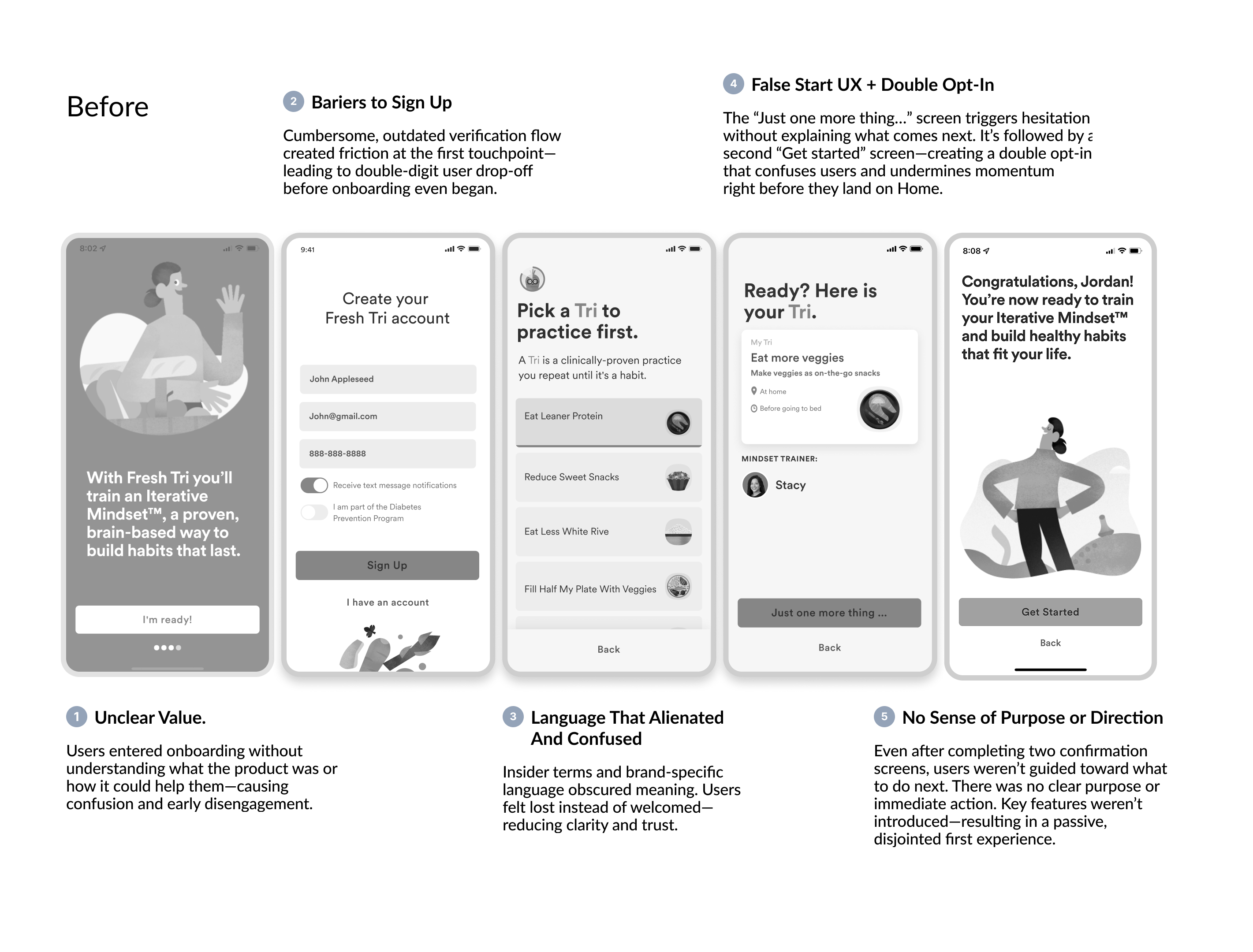
Before: Friction, Confusion, and Drop-Off
Before users even reached the core experience, onboarding created friction, confusion, and a lack of direction — leading to drop-off and missed opportunity.
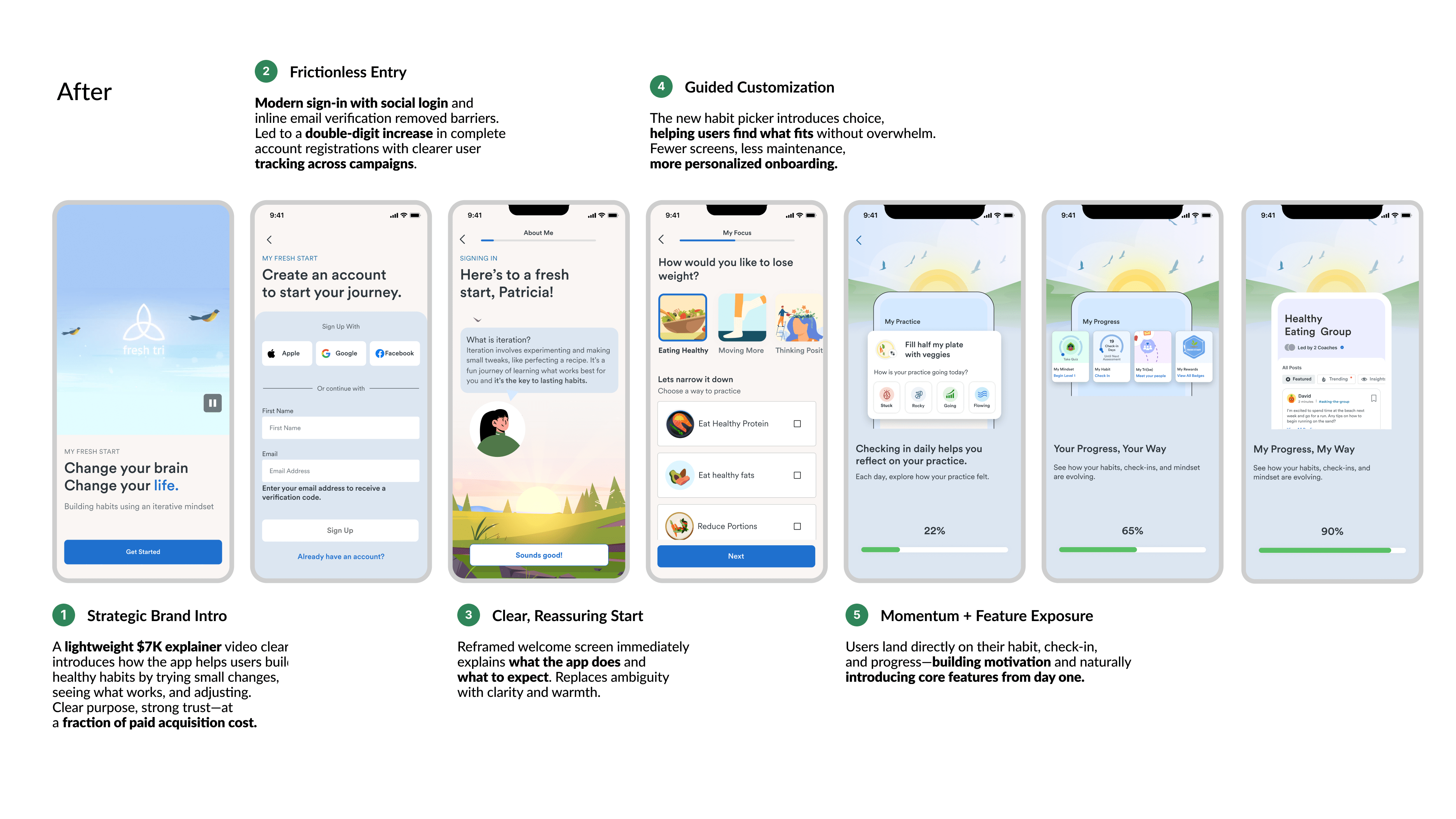
After: Onboarding That Sparks Engagement and Builds Habit Momentum
We rebuilt onboarding to feel intuitive, purposeful, and human. In fewer screens, users now get clear value, flexible choices, and a confident path forward — resulting in higher engagement and stronger activation.
Before - Onboarding
A fragmented, jargon heavy onboarding experience that overwhelmed and confused users
After - Onboarding
A delightful, intent-first onboarding that meets users where they are and moves them into action with clarity and momentum.
Updated Onboarding Flow -
Designed for maximum, clarity, momentum and delight.
Key Improvements:
- Stronger framing introduced the Iterative Mindset™ up front → users reported higher clarity in “know–don’t know” survey.
- Clear articulation of the Iterative Mindset™ and habit-formation approach upfront → users reported higher clarity in “know–don’t know” survey.
- Flexible choices let users personalise their first habit with ease → reduced early churn from mismatched habits.
- Confident CTAs created forward momentum instead of hesitation → double-digit lift in conversion rates across campaigns.
2.
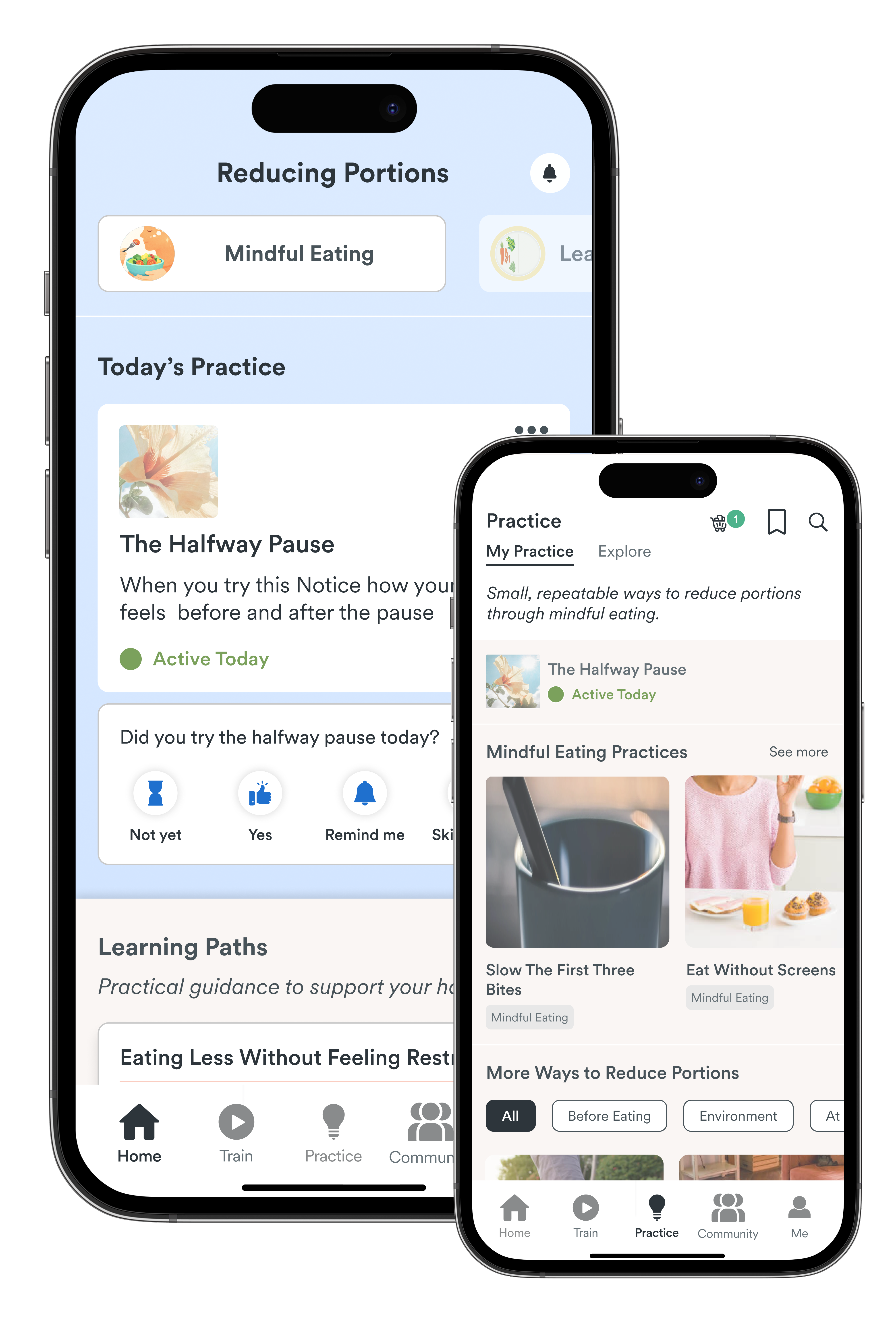
Designing AI-Enabled Practice for Daily Engagement
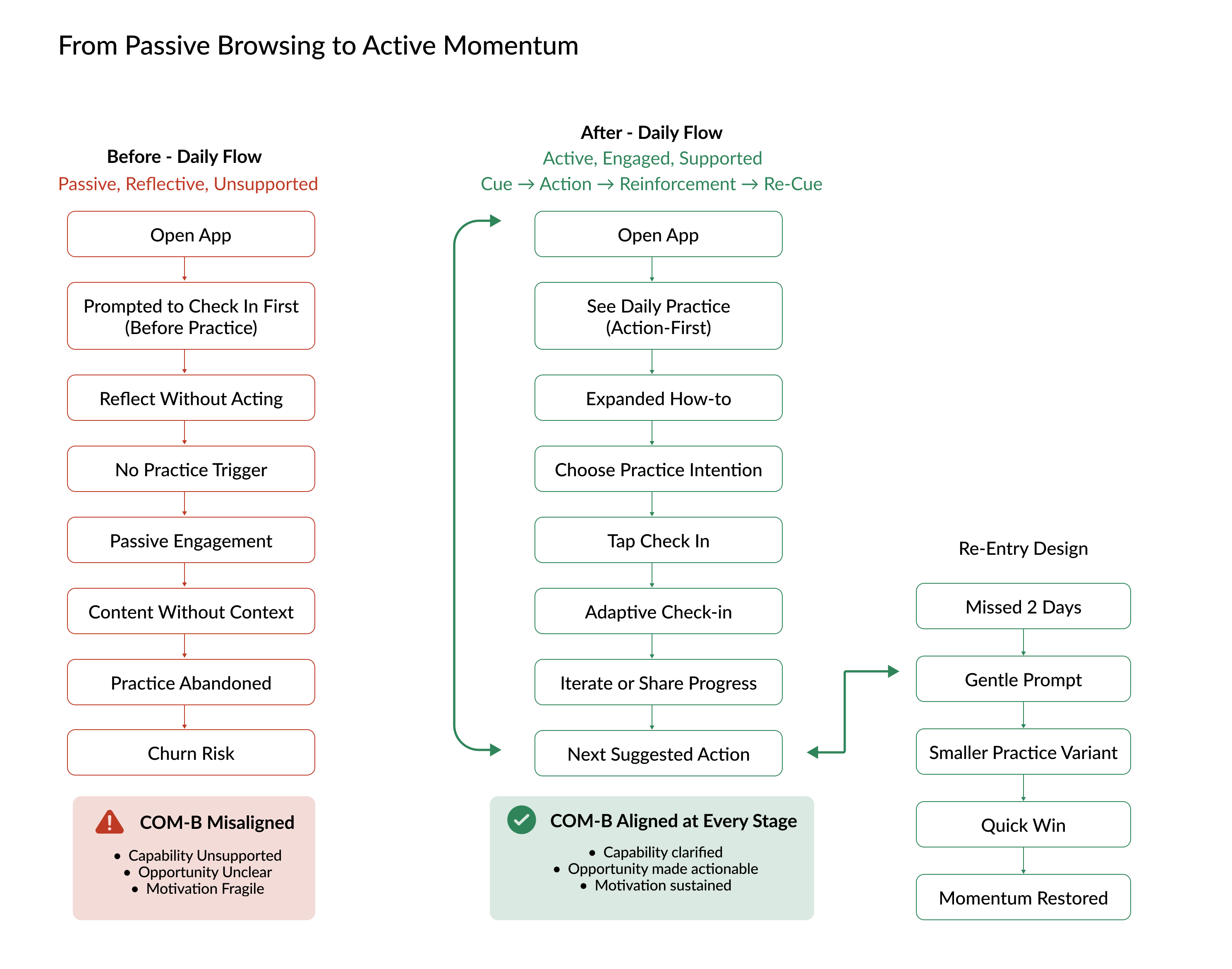
The legacy Home Screen surfaced generic content, then asked users to check in on a habit many didn’t yet know how to practice, turning the primary CTA into confusion instead of momentum.
Research was clear: users wanted practical, personal, adaptable pathways they could act on in the moment, not passive reflection.
The redesigned flow shifts to an action-first daily loop that clarifies what to do today, supports practice in-context, and makes it easy to adjust and keep going.
To support those loops with the right guidance at the right moment, we built AYA, a proprietary AI retrieval system that strengthened an underused content library and surfaced practical support without overwhelming the primary flow.
The new Home Screen centers the current habit, offers a clear next action, surfaces social proof, and tucks progress into a lightweight summary.
The daily practice loop mirrors the CREATE Action Funnel, moving users from clarity, to readiness, to action, and finally to reflection, all while keep to our non-performative messaging.
The Core Practice Loop in Action
Informed by user research and COM-B principles, the experience gives users something concrete to do each day, supports capability through practical guidance, and reinforces motivation through gentle reflection. Together, these moments form a repeatable loop that builds skill, shows progress through experience, and makes habit change feel achievable over time.
Check-ins Adapt to User Intent.
Each response protects momentum by supporting practice in different ways.
Home adds layered guidance to suplement daily practice.
AYA strengthened the content system and surfaced four support modes—Learning Paths, Practice Skills, Fundamentals, and Everyday Guidance—so users can go deeper when needed while practice stays primary.
AYA Turned Basic How-tos Into Practical, In-The-Moment Support.
We added clearer guidance, real-world context, and examples, responding to research that users wanted more application, stronger support in the moment, and visible social proof.
Key Improvements:
- Defined a clear daily practice loop that anchors users to a single, actionable suggestion, reducing choice overload and making it obvious what to do each day.
- Added personalized check-in responses that acknowledge effort and adapt to user input, reinforcing motivation and momentum without performance tracking.
- Reworked the Home Screen into layered practice support that prioritizes doing first, then learning, surrounding daily practice with optional guidance instead of competing content.
- Strengthened practice detail and supporting content using the AYA AI retrieval system to enrich existing how-tos with clearer guidance, real-world context, and practical examples.
3.
Designing for Focus First, Discovery Second
To protect momentum, we introduced planned friction between staying in practice and switching approaches. Nearby iterations are easy and visible, while full exploration is available but intentional.
This structure reflects behavioral science principles around ease, focus, and choice management. By minimizing early decision-making and introducing breadth only when users are ready, the system supports consistency while still meeting expectations for exploration.
Events are surfaced directly within the main feed, making participation visible without requiring users to navigate elsewhere.
Placing events alongside articles and video establishes events as part of the core experience, not a secondary feature.
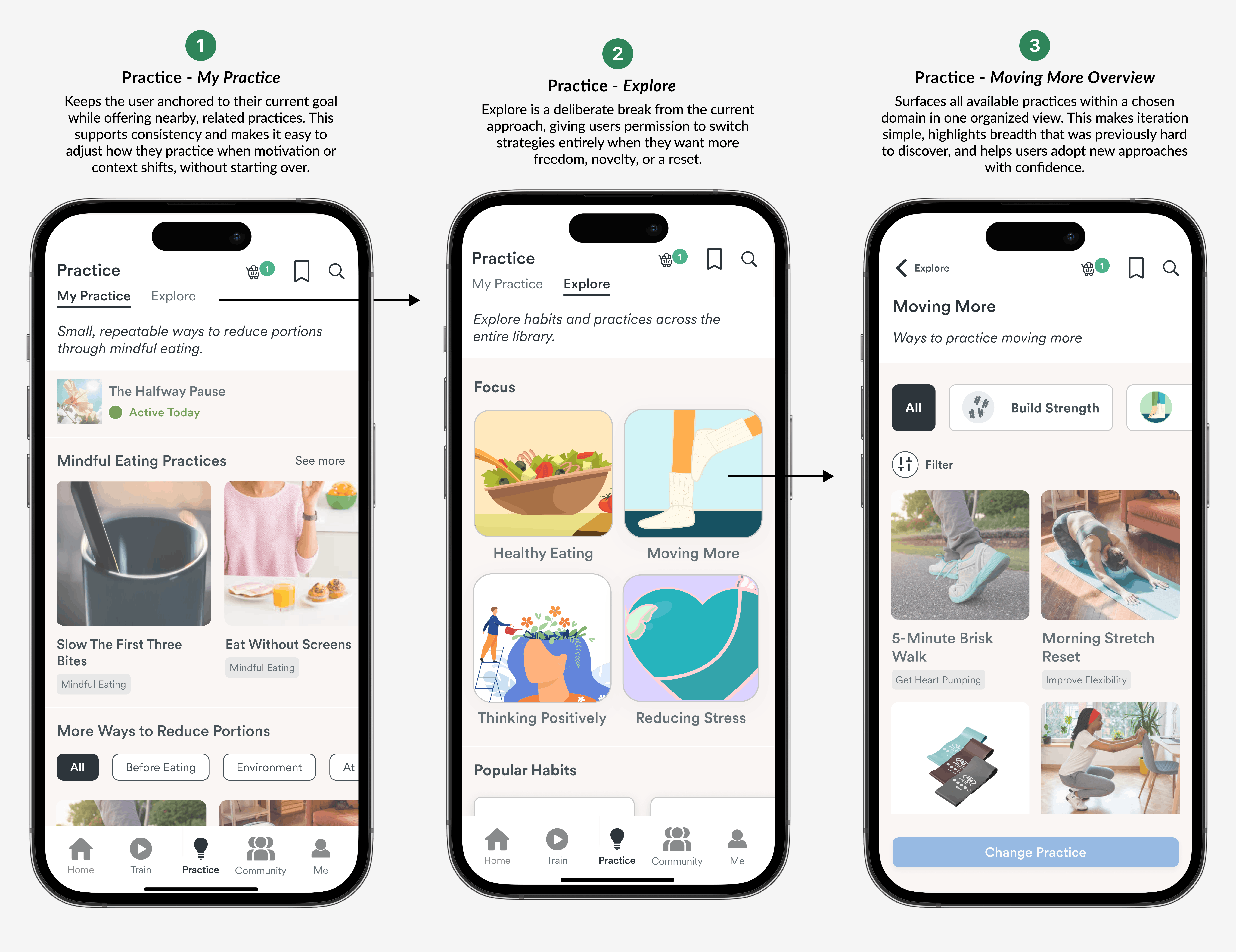
Practice Makes it Easy to Stay in Effort or Shift Direction.
My Practice keeps focus on the current goal, Explore enables intentional experimentation, and Habit Overviews make options easy to discover when content previously felt locked in or hard to find.
Learning Paths Provide Optional, Structured Skill-Building Over Time.
To support longer-term engagement and skill development, we introduced Learning Paths. Built from market and user signals, we repurposed and expanded how-tos with AI into sequenced paths that build capability and confidence using COM-B and CREATE principles.
Key Improvements:
- Drove stronger retention signals, including higher 7-day return rates, longer session depth, and increased progression through multi-step content.
- Expanded shallow how-tos into structured guidance systems, giving users clearer understanding of why practices work and how to adapt them over time.
- Introduced Learning Paths to support sequential skill-building, responding to research showing users preferred clear pathways over isolated tips.
- Increased depth of engagement by layering guidance alongside daily practice, without disrupting the core loop or adding cognitive load..
4.
Social Features That Delivered Product-Market Fit
Fresh Tri’s social feed once felt quiet and disconnected from practice. Without clear rituals or moderation, it failed to build belonging.
Our retention analysis showed that community was a key driver of stickiness—yet users didn’t feel invited or supported and options for enagement were limitted to random one off acts, lovely as they are.
We introduced lightweight, repeatable rituals, refined the posting and thread interactions of our affinity groups, and activated more engaged coacing interventions. To maintain safety and trust at scale, we layered in AI-assisted moderation to flag risks, tag quality content, and surface supportive behavior.
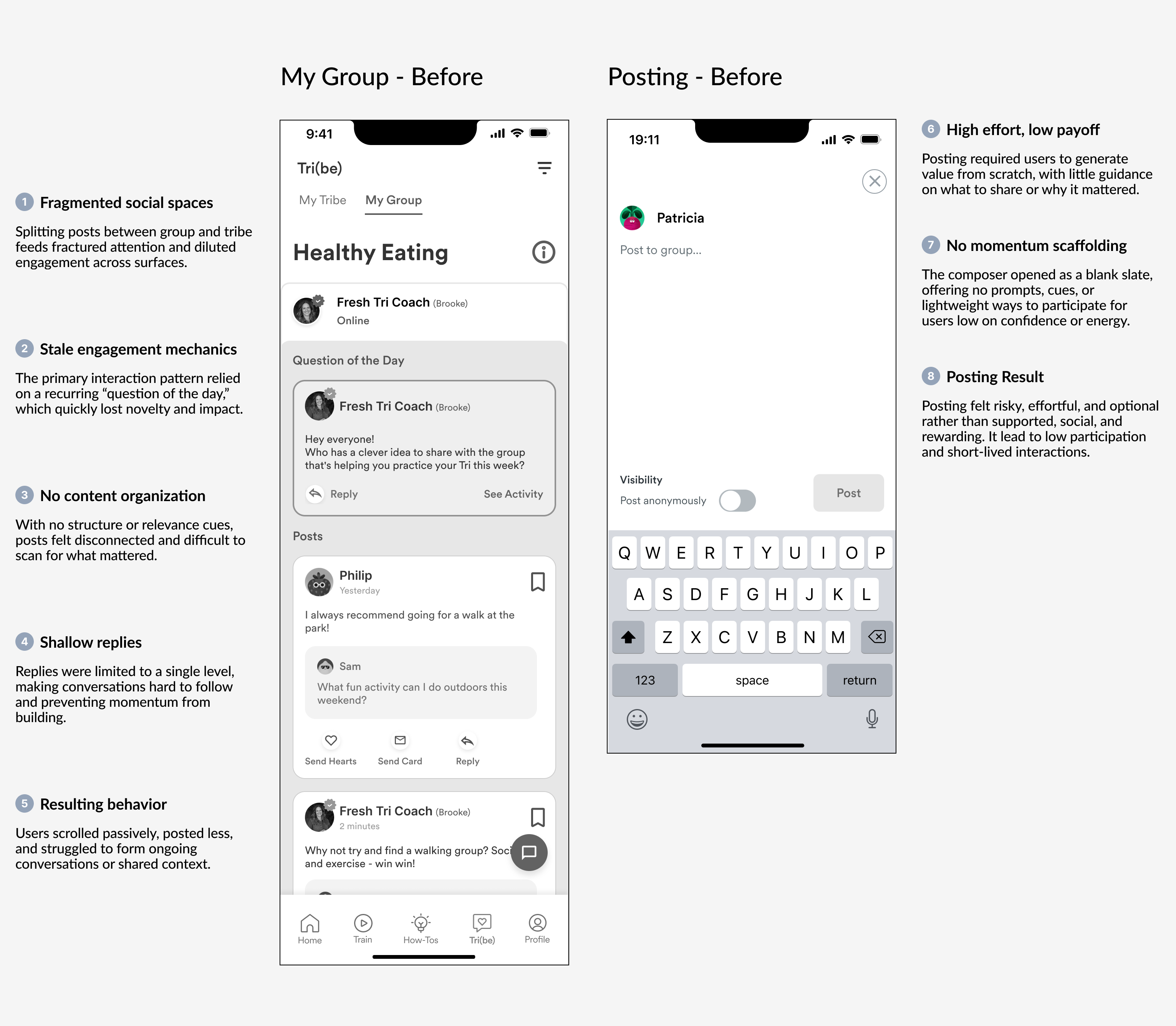
Before - Community Feed and Posting Experience
An unstructured feed and blank posting state placed the burden on users to create engagement, resulting in low participation and short-lived conversations.
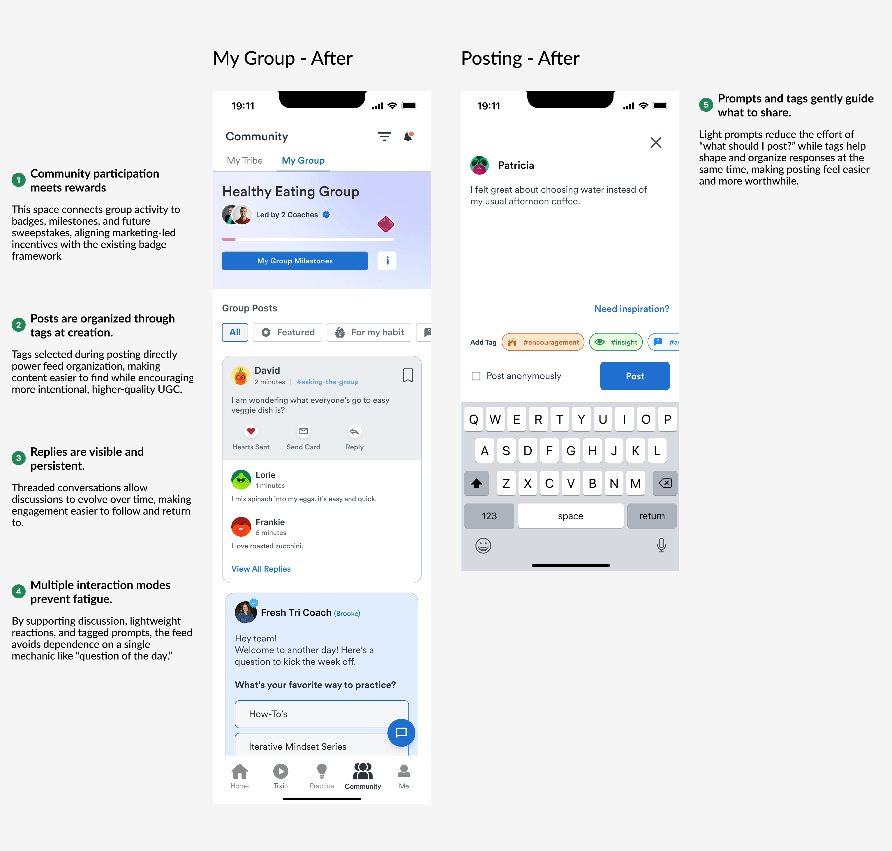
After - Community Feed and Posting Experience
A structured feed with threaded replies, clearer navigation, and guided posting (prompts + tags) made participation easier and conversations easier to follow and return to.
Before - Community Feed and Posting Experience
An unstructured feed and blank posting state placed the burden on users to create engagement, resulting in low participation and short-lived conversations.
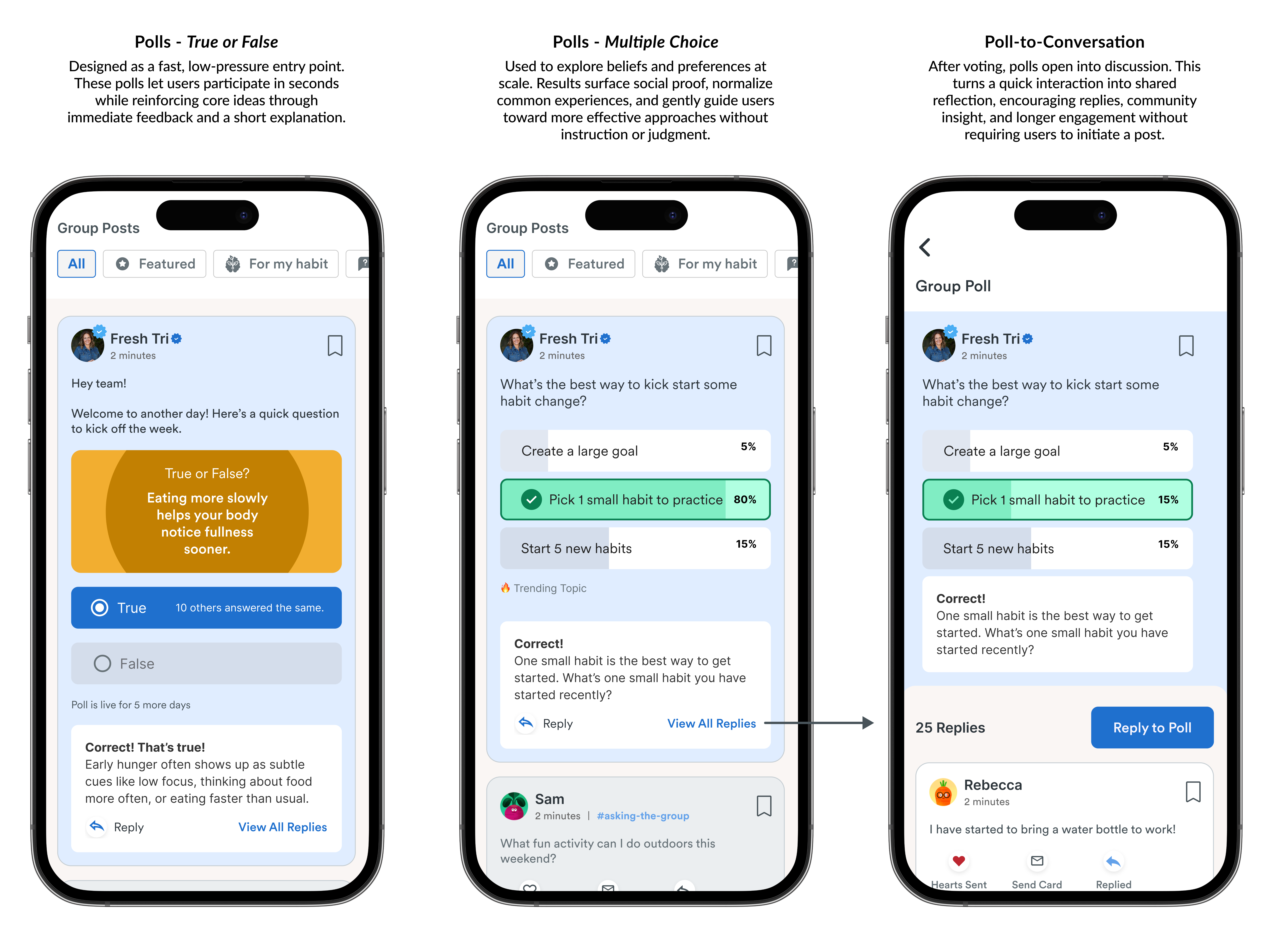
Polls Created a Fast, Low-Pressure Way to Emgage.
They increased engagement, added social proof through shared results, and opened the door to conversation, informed by user feedback and patterns we benchmarked from Flo.
Key Improvements:
- Replaced an unstructured, low-signal feed with a guided social system that makes participation easier and more meaningful.
- Used tagging to simultaneously organize content and encourage user-generated contributions, increasing relevance and discoverability.
- Introduced prompts, tags, and threaded replies to reduce posting friction and support sustained conversations,
- Layered in light gamification and group milestones to reinforce participation and connect social activity to progress elsewhere in the product.
5.
Making Mindset Training Feel Achievable and Rewarding
Mindset training was commercially critical to Fresh Tri and central to its long-term differentiation, yet research showed it was consistently undervalued. Users experienced it as abstract, effortful, and disconnected from daily practice, especially since two quizzes had to be completed before any visible payoff.
We reframed mindset training as a guided, game-like progression rather than an assessment. Clear expectation-setting, visual wayfinding, and a level-based map made the journey feel achievable, while small moments of delight reinforced progress along the way.
Completing Level 1 unlocked a personalszed Mindset Portrait—giving users a new avatar and a tangible reward for their effort. Assessment became identity, effort became momentum, and mindset training shifted from something users avoided to something they were motivated to finish.
Mindset Training Entry Experience
A clear invitation and visual map set expectations early, guiding users from a short baseline assessment to an immediate unlock, transforming upfront effort into momentum and motivation to continue
Avatar and Mindset Portrait Reveal
Progress is rewarded with a personalised avatar and Mindset Portrait, transforming assessment into insight and effort into a visible, motivating payoff that encourages users to complete the journey.
Key Improvements:
- Delivered strong commercial and engagement outcomes. Once users began the first quiz, 86% completed the full flow—both quizzes, all five episodes, and their Mindset Portrait.
- Established mindset training as a durable engagement driver. What was previously undervalued became one of the most consistently engaged features in the product.
- Aligned mindset training with user motivation and value. Shifted perception from “theoretical content” to practical, personal insight users could immediately apply.
Fresh Tri - Impact and Outcomes
A shift from content to practice. We rebuilt Fresh Tri around daily action: clear next steps, calmer guidance, and a system that could scale without losing quality.
Measurable Outcomes
- DAU up 70% within 9 months.
- 7-day retention streak up 127% within 6 months..
- Onboarding conversion: Increased onboarding conversion rate to 75th percentile of industry within 6 months
What Enabled Those Results
- A semantic design system built to scale.
- Not just tokens, meaningful components and intent-based patterns that travel cleanly across Figma, engineering, and AI-assisted workflows.
- A modular content engine with guardrails.
- AI helped us evolve “tips” into real guidance, but the win came from structure, sequencing, and review standards, not volume.
- A calmer, clearer home experience.
- Reduced choice noise. Increased “I know what to do next.”
Limitations & Learnings
- The value prop was powerful but hard to say simply. “Iteration,” “habit-neurology,” and mindset language made sense to us, but many users didn’t immediately grasp what they’d do today.
- We over-assumed people wanted mindset training. We built with the belief that users would invest in learning first. The market was moving faster so we pivoted toward practice-first to stay competitive.
- Practice needed to be provable, not just inspiring. The next evolution was tying daily practice to outcomes with SRBAI and our bespoke assessments—IMI and related instruments—so “practice” could be measured, personalized, and improved over time.
- The real differentiator wasn’t more content—it was tighter loops. Better sequencing, clearer next steps, and feedback from assessments mattered more than expanding the library.

