


A semantic, tokenized design system that made AI-assisted design practical at scale, helping teams iterate faster across product and marketing.


When I joined Fresh Tri, the design system looked serviceable. It had styles, components, and documentation. But as the product expanded and we began experimenting with AI-assisted design workflows, it became clear the system wasn’t built for what we needed next.
We were moving faster. Product and marketing needed to iterate in parallel. And tools like Figma Make and MCP workflows required structure and consistency to be useful. The existing system relied heavily on visual styles and ad-hoc decisions, which made both human and AI-assisted iteration fragile.
Before leaning into AI, we needed to rebuild the foundation.
AI-assisted self-provisioning in action: structured prompts on the left, brand-safe interfaces generated in real time on the right.
The core issue wasn’t missing components. It was missing meaning.
Colors, spacing, and states were defined by how they looked rather than what they represented. Components encoded layout decisions instead of intent. This made changes risky and made AI output unreliable. Generated layouts looked plausible but often broke hierarchy, accessibility, or brand logic because the system itself couldn’t communicate why things existed.
The shift was deliberate: stop designing for appearance and start designing for intent.

We rebuilt the system around a semantic token architecture designed to work for both humans and machines.
The system was structured in three layers:
This separation allowed us to change behavior without rewriting components and made design intent explicit and predictable.
Once semantics were in place, AI tools became usable in a real production context.
Design intent was machine-readable. Generated layouts respected hierarchy and state. Variations could be explored without breaking the system. Review shifted from cleanup to refinement.
AI stopped being a novelty and became a practical accelerator, because the system gave it guardrails.
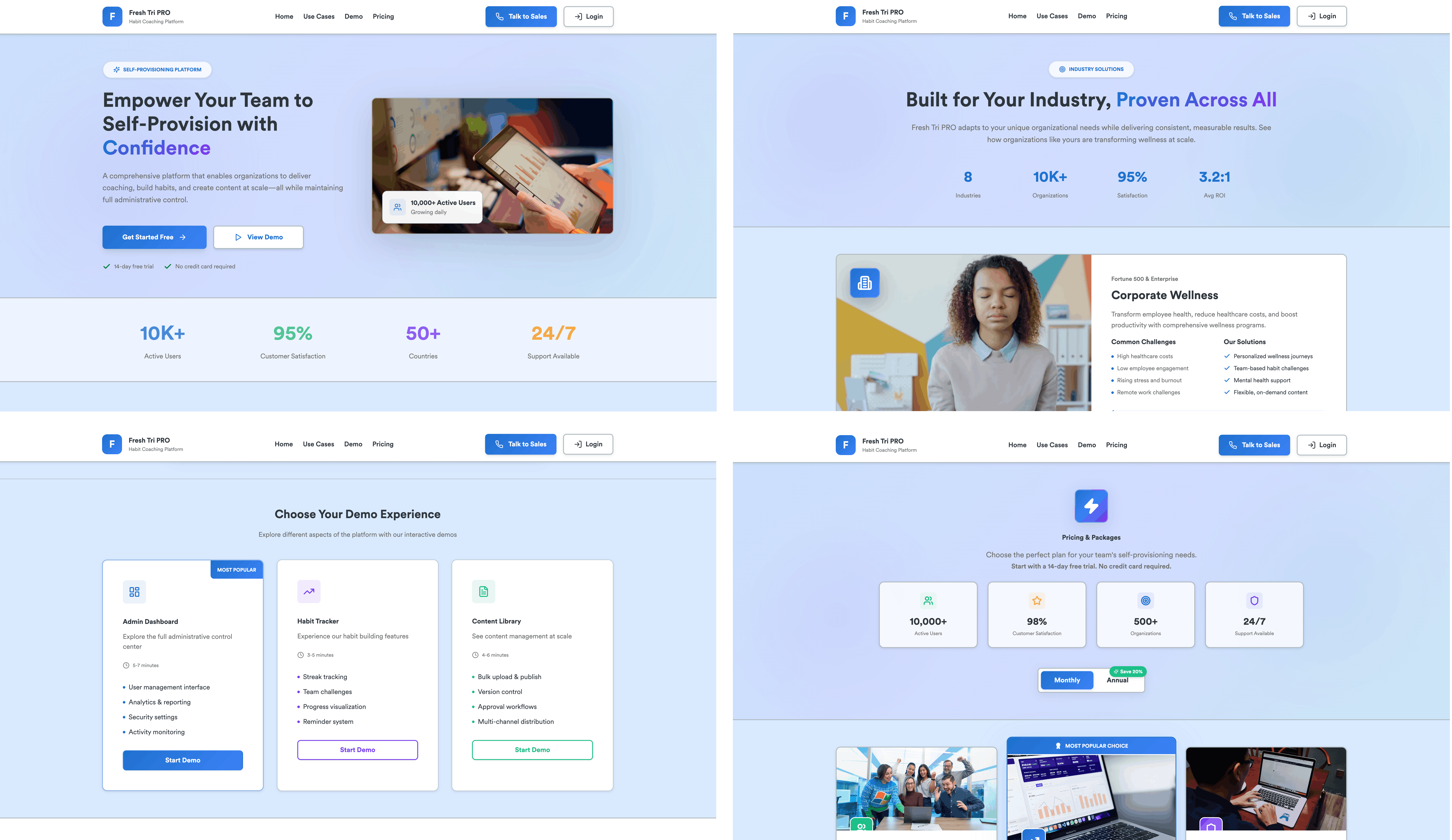
To test this in a real-world scenario, we used Figma Make to generate a self-provisioning website and admin flows for Fresh Tri PRO, our coach and operations platform.
Because admin tools have very different needs from consumer apps, we paired the design system with a clear set of AI-facing guidelines. These rules defined how Fresh Tri PRO should behave visually and structurally, prioritising clarity, speed, and trust over expression.

The guidelines covered:
In practice, this meant AI wasn’t guessing. It was following direction.
Within a single day, we had a workable, distinctive prototype that stakeholders could react to, discuss, and align around. It wasn’t final, but it was clear. And clarity was the point.
One of the most valuable outcomes of this work was consistency across surfaces. The same underlying system supported:
Design decisions no longer lived only in Figma files. They were embedded in tokens, components, and rules that could be reused, extended, and safely generated.
This reduced rework, improved handoff with engineering, and allowed the team to move faster without fragmenting the experience.